Transcript
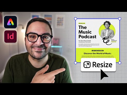
0:00 In this video, I'm going to show you a super efficient workflow for creating social media posts using Adobe Inesign and Adobe Express. Follow along in this tutorial as we'll go over how to design a square post in Inesign, export it as a highquality PDF, and then use Express's add size tool to automatically resize content for other platforms. As a bonus, I'll show you how to use the theme feature in Express to quickly change the look of your project by applying preset or custom color palettes. So, let's jump in and get started.
0:39 The first step is designing the square post for Instagram. If I open my CC libraries panel, you'll notice that I have all the assets that I need for this project. You'll be able to find these assets in the exercise files for this tutorial. If I click on the layers panel here, you can see that I have two layers currently. One called background and the other called content. With the background layer selected, I'm going to click on the rectangle frame tool and then click anywhere on the page. Ensure that your width and height are set to 1080x 1080 because that is the size of the page. And then click okay. I'm going to press V on my keyboard to access the selection tool and then position the background in place. Now, currently there's no fill in this shape. So, I'm going to go to the swatches panel. And you can see I've created a color theme grouped swatch here, and I'll choose this color here, this white color. Then, I'll go back to my layers panel and lock the background so I'm not moving it as I'm designing. Next, I'm going to click on the content layer and then click on the main shape and drag it over onto the layout. I'm just going to click to drop it in and then place it at the bottom of the layout just like so. Next, I'm going to add all the text onto this post. So, I'll click away and I have it copied on my clipboard. So, I'm just going to commandV to paste it in. That's controlV if you're on Windows. I'm going to extend the size of this frame. And you can see all the content I need for this post is here. Again, you can access this copy in the exercise files for this tutorial. I'm just going to move this off to the side and place it on the pasteboard. This way, I can have access to it and just copy and paste the text that I need. The first thing I want to do is copy the main title. You can see that at the very top. I'm going to actually just cut it and then click away and command V to paste it in. I'm going to place it something like this for now.
2:45 And I've gone ahead and added paragraph styles to make the design process easier for both you and I. So, I'm going to click on the paragraph styles panel which I have accessed here. And you can see all the styles have already been created. And then in this case, I'm going to choose main title. And just so you know, the font that's used in this design is called Gibson. And I'm just going to double click the bottom handle here to place that in. And then ensure that you have no spaces at the bottom. And then I'm going to double click again and position the title.
3:19 Something like that looks good for now. There's a little label that's going to go above this. So I'm going to cut that again. I'm going to click away. Command V to paste it in. And I'm going to place it at the top here. something like that. Go back to my paragraph styles and this is called tagline big. And I can close the paragraph styles window briefly. Double click to make that fit. I'm going to zoom in here and ensure that there's no space. And I'll do the same thing.
3:50 Double click to make that fit. And I'll bring it down a bit like so. Now, if you wanted to add a little bit more space, just bring it down like so. Hold option on a Mac, Alt on Windows. Doubleclick that frame and change the alignment from top to center and click okay. So now you can see that is centered to the text frame. And I can add a little bit more space just like so. So I think that looks a little bit better. I'll zoom back out and put my guides back on. And so the next piece is the subtitle.
4:24 I'm going to cut that text. Click on the selection tool. Click away and commandB to paste it in. And I'm going to place it underneath the main title. Now, this does have two separate lines here. I'm going to place my cursor in the first line. Go to my paragraph styles, and this will be called topic title. I'm going to place my cursor in the bottom line there, and this will be called guest title. Again, I'm going to click on the selection tool and doubleclick to make sure that the text frame is snug with the text. Now, this is a good moment to kind of space things out how you want them to appear. Again, there's going to be a little bit more text underneath.
5:08 So, maybe I'll just revert that a little bit. I'll select all three of these and move them up for now. And so, we have the description here. So, I'm going to cut that. Click on the selection tool again. Click away. Command V, ControlV on Windows. And this will be a little description to go along with the podcast title. And for this, I'm going to extend the box. Just click on the frame is fine. If I go to the paragraph styles window again, I can click body text. And you can see that that fits nicely. So, I've already set up my body text, my main title, my subtitle with the guest title. And I'm just going to again just space this out a bit. Doesn't have to be perfect. Press W. Click away and press W on your keyboard to turn your guides off. So, W turns them on. W turns them off. Just make sure that you're not selected to anything. I'm just going to maybe decrease the size of that. Perfect. Now I can bring in my main image which I have here in my CC libraries. So I'm just going to click on it once and then drag it over. You can see it's in my loaded cursor. I'm just going to click to drop it in and I'm going to place it something like this for now. I also have an arrow here which I'll click that and I'll drag that over and click anywhere to place it. And I'm going to place it somewhere around the main subject.
6:41 Now again, I like to look at things with my guides off. So I'm going to press W again. And you can see that's looking good. I can actually select both and maybe move them up a little bit. Something like that. And then click away. Now I want to add the podcast host name, which in this case is Dylan Sutherland. I'm going to click on the selection tool and then paste. I'll bring that frame over. And then if I zoom in here, I'm going to just click on the frame once. Go to your paragraph styles. And this is called host name text. We'll have to extend that frame because I want it to go over one line and not two. Maybe like this. Actually, maybe two looks good. If I extend that like so. And then bring this up. Make sure that you don't have a space there.
7:32 Click on the selection tool and double click again. I'm going to do command zero to go back to fit page and view. And that's looking good so far. I want the podcast host tagline. So I'm going to cut that. And I will command V to paste that in and place it right underneath the name of the host. And again, I'm going to just decrease the size of that. Make sure there's no spaces. And again, I'm going to select the text or just select the frame. And this will be tagline small.
8:10 And much like we did with the other tagline, I'm going to hold optional alt on Windows, double click, and ensure that that is centered to the frame. You can also center the text inside the frame. Shift command C. That's shift control C if you're on Windows. Again, I'm just going to press W on my keyboard and maybe move that over a little bit, just like so. And that's looking good as well. Perfect. Command Z to go back to fit in view. So, let's recap real quick.
8:42 We've added our main title, our subtitle with the guest title, our body text, the name of the podcast host, our main image, this arrow, and both taglines. I do want to add a little bit more text down below for this social media post promoting this music podcast. So, what I'll do is I'll select all of this text here and I'll cut it. And again, click on the selection tool, click away, and then do command or controlV.
9:13 And I'm going to place it down below here. And let's stylize this before we adjust the frame. So, I'm going to click on the first line. And I'm actually going to just cut the first line here. So I'm going to command X to cut it. Go back to my selection tool and then commandV to paste that in. That will be a separate text frame at the top. I'm going to double click to make that fit nicely. And let me zoom in here a little bit. With that selected, I'm going to go back to my paragraph styles window. And this will be tagline black. I'll do the same thing. And I'm going to just decrease the size or the width of that.
9:54 And then I'm going to make it center to the page. Hold option. That's alt on Windows. Double click. And let's center that. And I'm just going to expand the height of it just a little bit. Something like that. Looks better. Perfect. And now I can move this down. I'm going to doubleclick and then put my cursor inside of discover the world of music paragraph styles. This will be subtitle. And then I'll click anywhere in the text. Go back to my paragraph styles. And this is going to be body text center. And so let me just adjust the frame now. You can see I have some overset text. And something like that is looking good. Maybe a little bit more.
10:44 I think that looks good. Like so. And I'll center that as well. And then command Z to go back to fit page. W. I just have one more thing to add here. And it is the web page. So now I can delete that text frame and commandV to paste the web URL in. And I'm going to position that text at the very bottom. Let me zoom in again. Click on the text frame. You don't have to select the text in this case cuz it's just the one line.
11:17 And this will be website text. And we can close up our paragraph styles window. Just ensure there's no spaces here. And let's go ahead and double click that. And let's see how this is looking. If I bring this down a bit. Command Z to get an overview. W and I just like to space things out a little bit. So that is looking good. Next, let me show you how to set up your PDF for Express so the transition from Inesign is seamless.
11:47 Now, part of this workflow is ensuring that you have the proper PDF settings when exporting from Inesign to Express. Let me show you those. Go up to file and choose export. Choose the folder where you want to save the PDF. In the file format dropdown, ensure that you have Adobe PDF print selected and then go ahead and click save. Now, there are some settings here that you want to look after before exporting the PDF. In the general tab, choose the preset highquality print. Ensure that you're exporting all the pages. In this case, it is just the single page. Let's uncheck optimize for fast web view. You can also uncheck create tagged PDF.
12:33 Under the export layers dropdown, let's choose visible layers. Next, let's go ahead and click the compression tab. Under color images, let's choose do not down sample. And under compression, choose none. For the grayscale images, let's choose do not down sample. And under compression, choose none. And under monochrome images, choose do not down sample. And under compression, choose none. Let's click the output tab.
13:07 And in the color conversion dropdown, ensure that you choose no color conversion. And under profile inclusion policy, let's choose all profiles. Next, let's click the advanced tab. And in the subset fonts when percent of characters used is less than 100% let's change that value to 0%. This just ensures that all the fonts are embedded fully. Now before hitting export let's click save preset and I'll call this Adobe Express output just in case you use this preset again it's there for you. I'll click okay. Now I can click export to finalize the export. Now that we have the PDF all set up, let's jump over to Express, upload the document, and create more sizes. I'm on the Adobe Express platform now, and to upload the PDF from Inesign, click start from your content. Now, I can simply drag and drop the PDF to upload it to the Express platform, and that'll take just a few moments to upload. Once it's been uploaded, you'll see that all the content designed in Inesign carries over to Express and it's fully editable.
14:24 Now, we can go ahead and create multiple sizes based on our first post. To do that, let's first click on the resize button located in the upper leftand corner. Next, I'm going to click on social media and ads. Now, remember our first design is the Instagram square post. I want to add a couple other Instagram related post sizes. And in this case, I'll choose Instagram carousel, which is 1080x350. And if I scroll down to the very bottom, I'm also going to choose Instagram landscape post. And that automatically will duplicate and resize both based on your first post size. So, I'll go ahead and click that. And you can see that Express will generate the other two versions. Now, it's not going to be perfect. I'll still have to do a little bit of editing. So, I'll double click to go into the second page, which is the 1080 by 1350. And I can just maybe increase the size of the title. And you can increase the size of the frame.
15:25 Bring it down a bit. Maybe we can increase the size of this whole package. You can see that it is grouped. So, if I click that, you'll see a dashed border. And I can increase that together. And then I can move it down as well. So, something like that might work. And then I can click on the subtitle and increase the size. You'll just have to increase the size of the frame as well. So you can see your settings for increasing the size are on the left side panel. And I can move that up like so. And I'll do the same if I drag the handle on the text box outward. I can scale the size that way. Or I can use the adjustments in the left menu to increase the text size. And again, just adjust your frame accordingly. And with this last one, with the text frame at the very bottom with the body text, I'll just do the same thing. I'll increase the size, extend the frame a little bit so the text covers a little bit more white space. And again, you can even move some of this off to the left side if you want. Something like that, just to give yourself a little bit more space. And move it up and so on and so forth. If I pan to the bottom of the page, I can do the same thing. First, I'll expand the text frame of the subtitle and center it to the page. And then I'll just increase the size using the adjustments in the left side menu. And then I'll do the same with the body text below. Maybe move it up a bit and increase the size.
16:51 So, you can see that I'm just adjusting it. Just minor tweaks here. There's nothing really big that you're doing. Just kind of altering the sizes of things. And then, of course, you can move this stuff down as well. Something like that will work. Perfect. So our second post is done. To go back to all the posts, you can click on this icon in the bottom right hand corner to view all the pages. So you can see the first two are done. And now I can edit the content on the third page before moving on.
17:21 All right, I've edited the content on the third and final Instagram post. And of course, you can add more sizes by choosing any of the existing pages and then selecting different dimensions from one of the categories in the left side menu. As a final step, let me show you how to adjust the look and feel of the posts with Adobe Express's theme feature. Another great feature built into Adobe Express is the ability to change the color theme and the overall look and feel on the fly. Now to do that I can click on the theme button located in the top ribbon and you can see that that will bring up various preset swatches here. Now if I click on the first one for example that will change the color theme to that swatch theme. I can make my way through some of these other ones. You can see that they're updating in real time. Now I do like this one. And if I wanted to change this across the entire document, just scroll to the very top and you can see here's my page theme that with the colors that I've chosen. And all I have to do now is click apply to all pages to apply it to all the pages across the document. And you can see that the other two pages have been updated accordingly. Now, if you want to download these and start sharing them on social media, go ahead and click the download button located in the upper right hand corner and choose all pages and then the file format. I'm going to choose PNG. And as a final step, I'll click download. That will create a zip folder that I can open up.
18:52 And you can see that all three of my images are here. Here's the first, there's the second, and there's the third. Thanks for watching and I hope you can use this workflow between Inesign and Express the next time you're creating social media assets. If you found this video helpful, leave a like and don't forget to hit the subscribe button so you don't miss any of my future uploads. Check out these playlists if you want to learn more about InDesign and Express. Thanks again for watching and I'll see you in the next video.